
It's about time to finalise my series on Geo-spatial analysis in Oracle Business Intelligence. In this post I'm just laying out the necessary steps to add new map views to your analysis.
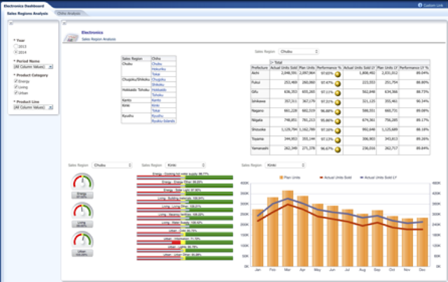
A dashboard with some reporting objects. The idea was to replace the top left table with a map view. In order to do that, the following steps need to be taken:
1. Open dashboard Electronics Dashboard (initial).
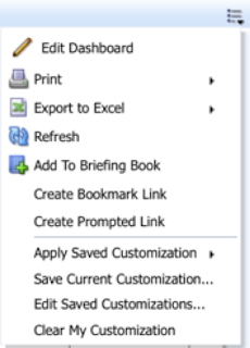
2. Click Page Options and select Edit Dashboard option from the menu.
3. Notice that Electronics Dashboard consists of two objects:
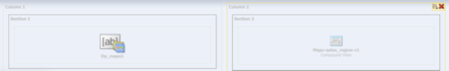
On the left side, there is a dashboard prompt and on the right, there is a compound view of Map-sales region v1 analysis.
4. We will focus only on Map-sales region v1 analysis. So let's edit it.
5. Click Results tab to view some results first.
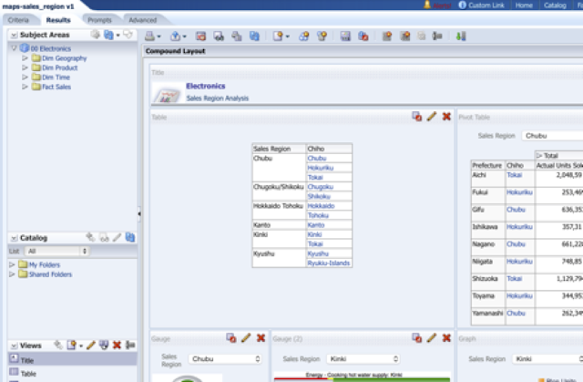
6. As said, we need to replace Table view with a Map view. So let's create a new map view first.
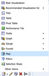
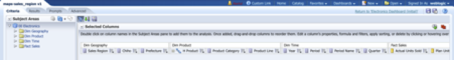
7. Map view opens. From the list of available maps, select Electronics (this is the one, prepared in previous post).
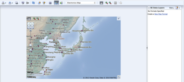
Map of Japan (Asia) is shown. Observe that there are no layers displayed yet. We need to add them to this base map as New Map Formats. These Map Formats will already present values of selected measures, for example, we can turn on color coding of Sales Regions by Actuals Units Sold.
8. Table on this page contains data about sales regions and chihos. There are some interactions based on data in this table already preset. If you click on Sales Region, all objects on the page will be synchronized according to the selected Sales Region. Chiho column has a different type of interaction, we have preset action link that opens Chiho level sales analysis dashboard page.
We want to keep this type of behavior with the exception that we replace table view with a map. Click on Sales Region should synchronize objects within current page, zoom in and click on Chiho should open new dashboard page with Chiho level analysis.


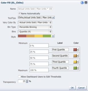
20. Add similar color coding and bubble information for Chiho level.
21. Add Color fill for Chiho:
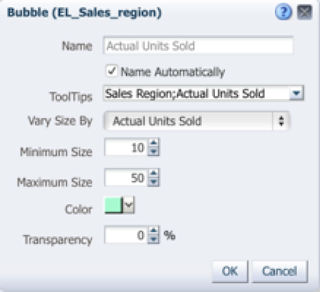
22. Add bubbles for Actual Units Sold on Chiho level:
23. Click Done when finished.
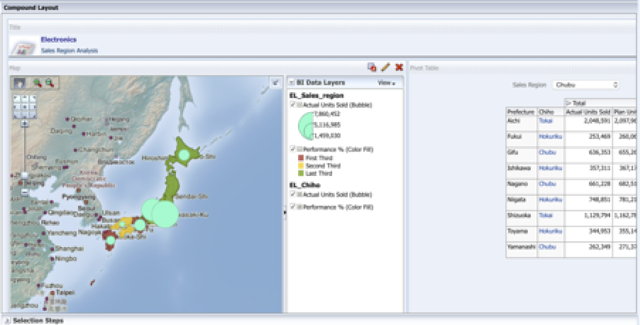
24. Delete Table view from Compound View and replace it with Map View.
25. Rearrange Gauge views so they are both below Map View.
26. Save your analysis and return to your Electronics Dashboard
27. Inspect your dashboard page for:
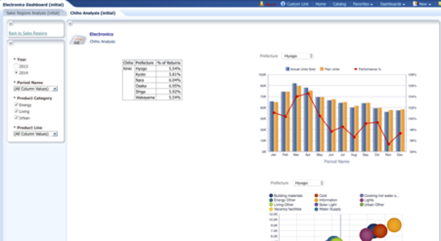
28. Now, let’s replace table on this dashboard page with the prefecture level map.
29. Edit Maps-chiho v1 analysis.
30. Click Result tab and create new Map.


A dashboard with some reporting objects. The idea was to replace the top left table with a map view. In order to do that, the following steps need to be taken:
1. Open dashboard Electronics Dashboard (initial).
2. Click Page Options and select Edit Dashboard option from the menu.

3. Notice that Electronics Dashboard consists of two objects:

On the left side, there is a dashboard prompt and on the right, there is a compound view of Map-sales region v1 analysis.
4. We will focus only on Map-sales region v1 analysis. So let's edit it.

5. Click Results tab to view some results first.

6. As said, we need to replace Table view with a Map view. So let's create a new map view first.

7. Map view opens. From the list of available maps, select Electronics (this is the one, prepared in previous post).

Map of Japan (Asia) is shown. Observe that there are no layers displayed yet. We need to add them to this base map as New Map Formats. These Map Formats will already present values of selected measures, for example, we can turn on color coding of Sales Regions by Actuals Units Sold.
8. Table on this page contains data about sales regions and chihos. There are some interactions based on data in this table already preset. If you click on Sales Region, all objects on the page will be synchronized according to the selected Sales Region. Chiho column has a different type of interaction, we have preset action link that opens Chiho level sales analysis dashboard page.
We want to keep this type of behavior with the exception that we replace table view with a map. Click on Sales Region should synchronize objects within current page, zoom in and click on Chiho should open new dashboard page with Chiho level analysis.
So let’s add some Map Formats to the map.
9. Click Create New Map Format or new icon to open the following menu:

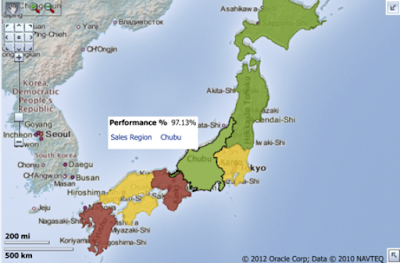
10. Select Color Fill as we want to color code Sales Region based on Performance (actual/plan) value.
11. Select Sales Region from the list of available Layers
12. Select the Actual Units Sold/Plan Units *100 from ToolTips pull down list

13. Select Select the Actual Units Sold/Plan Units *100 also for Vary Color by field.
14. Set other attributes as follows:

15. Click OK to close Color Fill dialog.
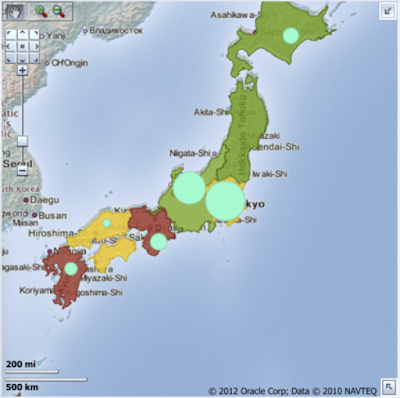
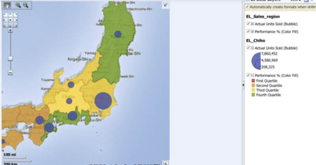
16. Map view shows new color coding based on Performance %.

17. Adjust size of the map. Click on map view properties above the map.

18. Map is resized now, so Japan fits into the frame:

19. Let’s add additional information to the map on Sales Region level. For example you can add a bubble that shows value of Actual Units Sold.


20. Add similar color coding and bubble information for Chiho level.
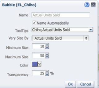
21. Add Color fill for Chiho:


22. Add bubbles for Actual Units Sold on Chiho level:


23. Click Done when finished.
24. Delete Table view from Compound View and replace it with Map View.

25. Rearrange Gauge views so they are both below Map View.
26. Save your analysis and return to your Electronics Dashboard
27. Inspect your dashboard page for:
- Master-detail interaction with objects within Dashboard page
- Color coding and bubbles.
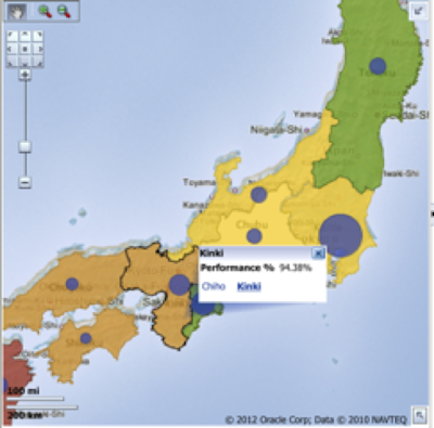
- Zoom in to Chiho level and check action link.


28. Now, let’s replace table on this dashboard page with the prefecture level map.
29. Edit Maps-chiho v1 analysis.
30. Click Result tab and create new Map.

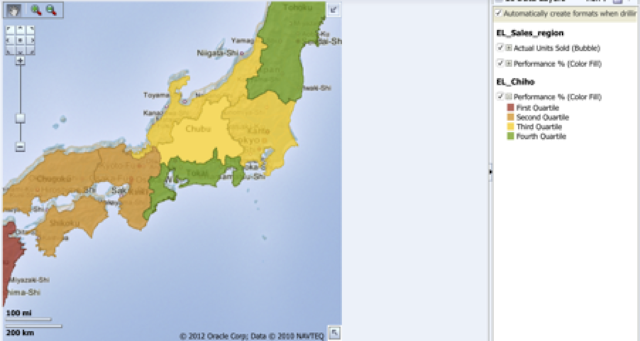
31. Arrange now this map as you did for the sales regions and chihos:
32. View your dashboard page with a map:


